
Hello Wonderful Students, I just wanted to let you know that I will be teaching in Italy for a few weeks and probably won't be sending out any official lessons posted on the private pages while I am away. However, every Monday I will post directions, drawings and paintings on my regular blog so that you can paint along with me once a week in Italy without leaving home. I look forward to resuming our private lessons beginning again the beginning of November. Feel free to email me questions and your work, I will have time to critique your work and answer you questions. Ciao, Barbara
Lesson 34 - Using Value Charts
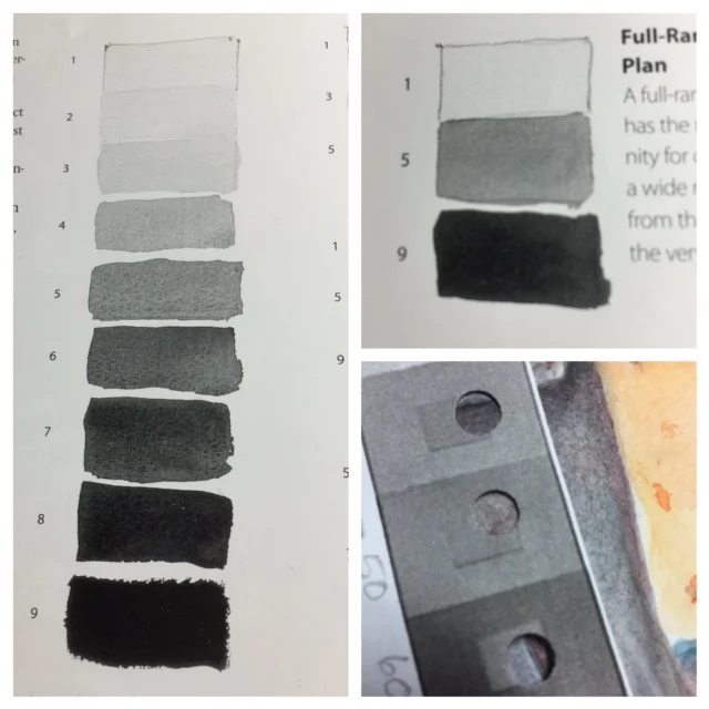
Have you painted a value chart yet? You ought to paint one. Try it first with 3 values like the one you see on the top right below. If you keep this concept in mind while you are painting, your painting will have more depth and life and contrast and excitement and you will become rich and famous.
After you feel comfortable with 3 values, see if you can paint nine values and white which will give you 10 values. You don't have to have all 10 in your paintings, but if you punch wholes in your chart, you can compare what you have painted to your subject and see if your values are correct.
The painting above has only 2 values, very light and light. It needs more values to make it wake up.
To see values more clearly squint at the painting above. How many values do you see? I see light, medium and a few darks.
Your assignment is to paint paintings trying to see the values and include them. When you jump into color from greys and blacks be aware that yellow is the lightest color, then orange, then red, then green, then blue and purple is the darkest color. So if you want to darken a color add a darker color or just use less water. Water is the watercolor painters white paint, it makes a color lighter.