
Lesson 22 Painting a Watercolor Flat Wash
I hope your 4th of July celebration was a lot of fun. Now it's time to buckle down and practice watercolor techniques. A flat wash is the basic of watercolor painting. The pictures on this page go along with this video I made so you could see moving pictures of everything you need to know to begin painting successfully. https://www.youtube.com/watch?v=qZ7qxP8QpQ0
I painted the aloe plant with a series of flat washes. I let each wash dry completely before I painted another wash over it. I painted each leaf individually and moved to another leaf that wasn't touching the wet leaf when I wanted to paint another leaf. I kept adding more layers of washes and left some of the initial layers of wash uncovered, those are generally the lightest tone you see in the painting except the white of the paper. I added darker colors where I needed darker tones. Finally I painted the background with 2 layers of washes.
You can see in the photo above how the plant looked sitting on my desk. It has a shadow cast to the left side of it, because I had the desk lamp shining on it from the right side, which is the best position to light your still lifes because it gives you good shadows. In the painting above in the top right square, you can see that all of the darks are not in. In the picture below on the right, I added my final darks. Those are the only areas of paint where I did follow the wash bead, but instead kind of dotted in the dark paint with the tip of the brush then smoothed the edges to blend it in with a clean damp brush.
Above is the finished painting, plus samples and names of all the colors I used. I have been testing out inexpensive watercolor papers, and the cover you see in the bottom right picture is the paper I used, Canson, XL 140 lb. watercolor paper. I think it worked fine for this painting.
Your Assignment for Week 22 is to paint as many objects as you have time to paint using mostly the flat wash technique. Let me know how it goes.
Lesson 23 and 24 23-Value Sketches and 24-Color Next to Color
Value sketches
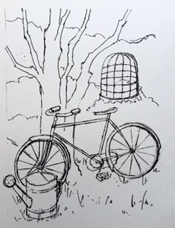
You can use this line drawing for your painting or draw one from your own photos
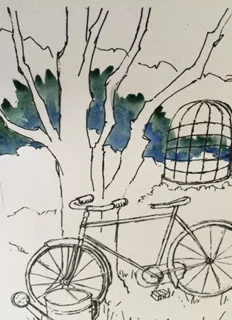
Begin adding paint by laying the colors right next to each other and letting them mix themselves.
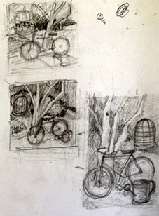
Since I am going to be traveling next week, I am going to give you two assignments right now for this week and next. I used for the photo of the bicycle and the tree above. I wasn't exactly sure if it would make a good painting, so I decided to try out different arrangements or compositions of it in value sketch form.
I always draw 3 value sketches in order to come up with 3 different patterns of values, (you must have at least 3 values, light, medium and dark plus the white of the paper or more) and differing arrangements of the objects in the pictures. You can see from my sketches that I moved the wire structure to the right of the picture and added branches to the tree plus moved around the watering can. I ended up liking the bottom right sketch the best, so I made that into a line drawing to paint.
Assignment #23 -Either use my picture of one of your choosing and practicing drawing value sketches. If you can get in the habit of doing quick value sketches before every painting you want to paint, you will have much better paintings and less anxiety during your painting process since you can use your value sketch as a roadmap that clearly outlines where to paint your dark, medium and light colors.
Assignment 24- Use a value sketch to plan where to paint your colors in your painting. If you need some colors to be darker especially the greens, try adding a darker blue like ultramarine or prussian blue. For a very dark green you can add a blue violet like dioxine violet or Wlinsor violet. To dull down a green try adding a bit of its complement, red. As for painting technique try laying down the colors next to each other and mixing while each color is wet. Or you can try laying down the 2nd color after the first one is dry and overlapping the first color a bit but still letting a lot of the first color show. OR you can let the first or 2nd layer dry then add another color anywhere you want. Happy Painting!
Lesson 25 Mixing and Painting with Green!
Mixing different shades and colors of green paint creates problems for most painters. So this week's assignment #25 will be to concentrate on finding images or using the photo below to learn to paint a variety of green colors.
I listed and numbered the different greens I found in the photo here of a window. I included the colors I would mix to get the particular green.
1. Thalo blue + yellow or permanent green #2 or sap green + thalo blue
2. Lemon yellow + sap green or yellow ochre + sap green which would make a more olive yellow green.
3. Cerulean blue + sap green.
4. Cobalt blue + sap green.
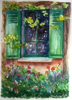
5. Cerulean blue + sap green + yellow.
So have a good week looking at greens and please share your new green paint recipes with me.
In the watercolor painting below , I tried to use lots of different mixtures of green. I hope you can see by looking at it, that some greens are closer to lemon, some greens have a bit of turquoise in them, some of the greens are close to a "kelly green" and some have a bit of purple or red.